Pantone’s Color of the Year says more about technology and politics than it does art
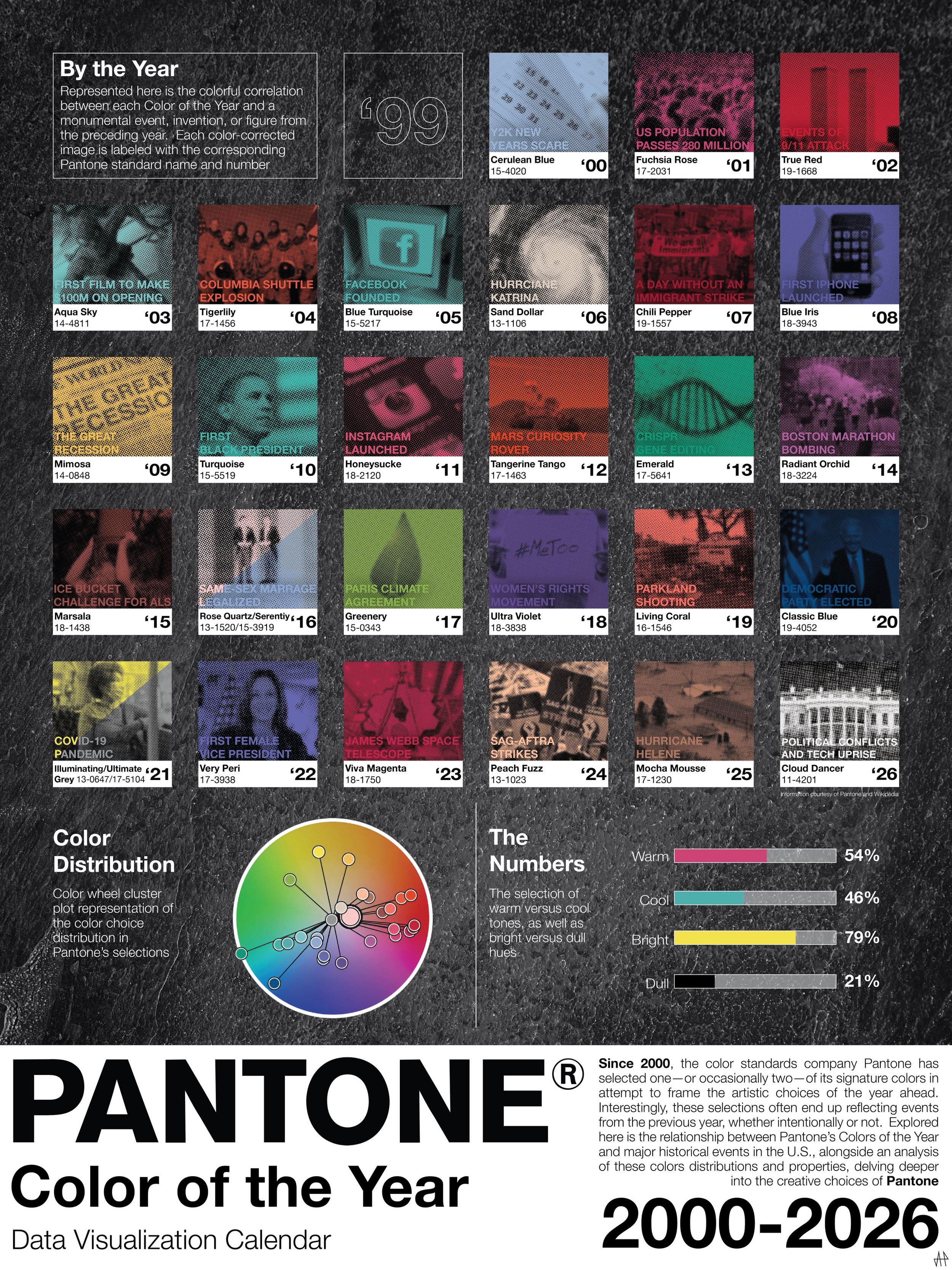
Graphic Courtesy of Alexis Henderson
Pantone’s Color of the Year is white — pardon, “Cloud Dancer” — which is what I'm convinced ChatGPT replied with when someone from the company asked for a synonym for white.
Only something as unlively as a robot could take vibrancy away from life, and that is exactly what “Cloud Dancer” signifies to me: the ongoing move towards a technology and AI-dominated world.
For those unfamiliar with Color of the Year, Pantone introduced the concept in 1999, with the first color (Cerulean Blue) chosen to represent 2000, as a means to promote conversation about the influence of color in design in the new millennium.
“We wanted to draw attention to the relationship between culture and color,” said Vice President of the Pantone Color Institute Laurie Pressman in a 2023 interview. “We wanted to highlight to our audience how what is taking place in our global culture is expressed and reflected through the language of color.”
Although the exact selection process is largely unknown, each year a color is chosen by a team of Pantone’s own global color experts who help predict various trends across different aspects of culture, such as entertainment, travel, fashion, socioeconomic conditions and technology.
Pressman acknowledged that technology has become an increasingly significant influence each year since the project began. But this year, technology has seemed to have taken over entirely.
Leatrice Eiseman, executive director of Pantone, told CNN that their selection this year is “associated with new beginnings” and “signifies our desire for a fresh start.”
But despite desires, nothing is really changing in 2026. Honestly, a clean slate for a color would have been a better choice going into 2025, when a new presidential administration was taking office and the year marked the quarter of a millennium.
But instead, in 2025, the color of choice was “Mocha Mousse,” a shade of light brown said to evoke a “comforting warmth.” But hey, at least brown has hues.
Eiseman told USA Today that “Cloud Dancer” is intended to counteract the feeling of suffocation or bombardment caused by technology. However, I do not feel the “calming influence” and “quiet reflection” that “Cloud Dancer” is said to hold. It feels sterile and high tech.
This year, Pantone might as well have said, “AI, pick what color you want to represent the next year” — and, let's be real, it already could do that. So quit promoting technology’s influence in creativity and the arts when it is unrightfully encroaching.
There are also larger complaints that extend beyond the uncreativity behind the selection to the presumed political alignment and the statement that choosing a shade of white implies.
Some gave Pantone the benefit of the doubt, calling the selection a sign of not wanting to make a bold statement — but that is exactly the point of color: to draw attention.
Jacob Gallagher of the New York Times called it “an ideal pick for this fence-sitting period where no one wants to offend anyone.”
However, to me, that is letting the brand off too easily.
A more extreme interpretation that has gained momentum online is that it signifies divestment in diversity, equity and inclusion (DEI) and feelings of white supremacy. Which is not much of a stretch, as 2025 saw cuts in DEI programs, ongoing ICE raids and of course the infamous Sydney Sweeney “great jeans/genes” ad.
It’s almost as if Pantone predicted a cynical and artificial response to their selection. In a last-minute effort, they tried to force a natural and human tone onto white — which is debated whether it's a color or not — by calling it “Cloud Dancer.”
“Cloud Dancer” is far from what takes center stage in the palettes the brands suggest, and for that reason, I hope it does represent all these grim subjects so we can see them fade into the background of 2026.